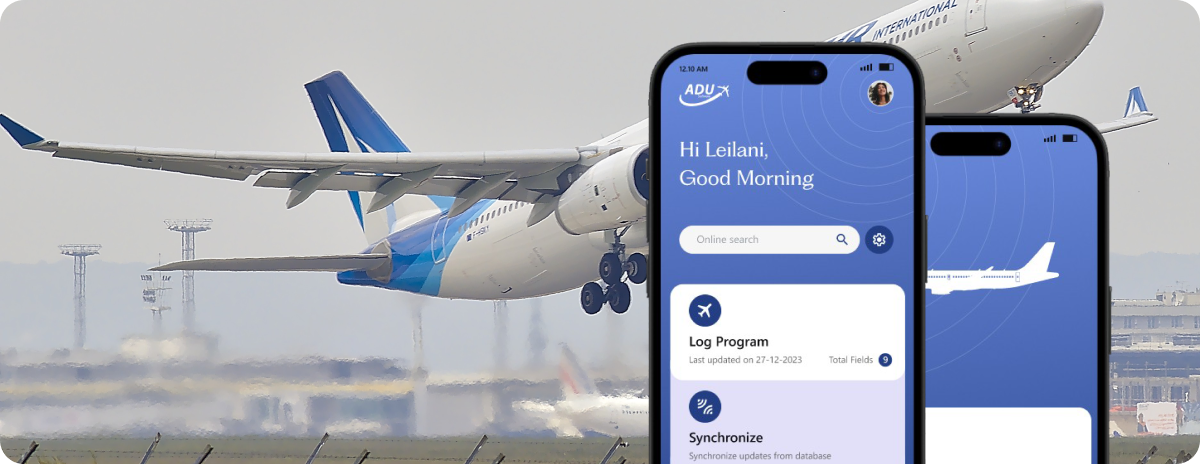
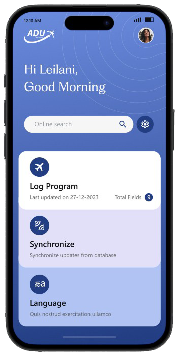
ADU Aviation Mobile App - Aircraft spotting & logging experience
RoleProduct Designer
Duration1 Weeks
PlatformMobile
TypeAviation Utility App
Overview
ADU Mobile App is a companion application for aviation enthusiasts and aircraft logbook users. The platform helps users search aircraft, log sightings, and synchronize records with the ADU desktop database.
The original experience was functional but visually outdated, difficult to use in fast-moving airport environments, and lacked a modern mobile-first interaction model.
I redesigned the experience to create a faster, cleaner, and more intuitive aircraft logging workflow optimized for mobile usage in real-world airport scenarios.
Problem
The previous product experience created friction in high-speed aviation environments.
Users often
- Operated the app outdoors under time pressure
- Needed quick search and logging actions
- Used the app one-handed while moving
- Switched between searching, validation, and logging rapidly
The existing UI lacked
- Clear hierarchy
- Fast scannability
- Modern mobile usability standards
- Efficient logging workflows
- Visual consistency
My Role
Responsibilities
- UX Research
- Information Architecture
- UI Redesign
- Mobile Interaction Design
- Design System Thinking
- Workflow Simplification
- High-Fidelity Prototyping
Design Goals
Primary Goals
- Reduce time to log an aircraft
- Improve readability outdoors
- Simplify search and logging workflows
- Create a modern aviation-themed visual identity
- Improve touch accessibility for mobile usage
- Make synchronization feel reliable and understandable
UX Success Metrics
- Faster aircraft lookup
- Reduced cognitive load
- Better visibility of aircraft details
- Improved interaction clarity
- Easier syncing confidence
Research & Insights
User Types
Aviation EnthusiastsUsers who actively track and record aircraft sightings.
Frequent Travelers / Airport VisitorsUsers spotting aircraft during travel.
Existing ADU Desktop UsersUsers already maintaining aircraft databases on PC/laptop.
Key User Pain Points
| Pain Point | UX Impact |
|---|---|
| Too much information displayed at once | Difficult to scan quickly |
| Older interface design | Reduced trust and usability |
| Small interaction areas | Hard to use outdoors |
| Aircraft logging workflow felt complex | Slower operation |
| No clear visual prioritization | Important data gets lost |
| Desktop-oriented thinking in mobile UI | Poor mobile experience |
UX Strategy
I focused on transforming the experience into:
"Fast Aviation Logging Experience"
The redesign principles were:
- Minimal interaction steps
- Large touch-friendly controls
- Strong content hierarchy
- Calm visual system
- High contrast readability
- Modular card-based architecture
- Faster search-to-action flow
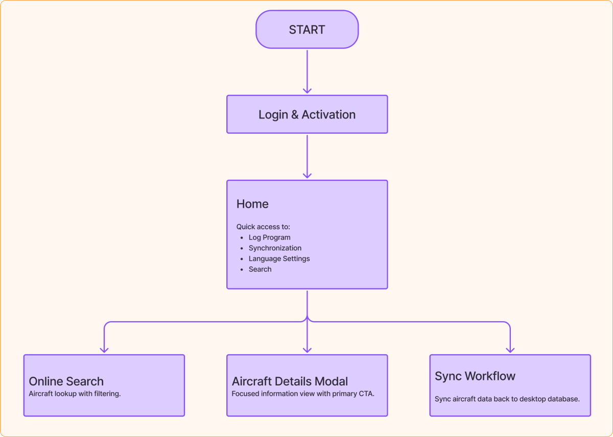
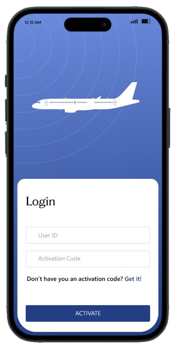
Information Architecture
Core Navigation Structure - The app was restructured into a simple task-oriented flow instead of a complex feature-heavy structure.
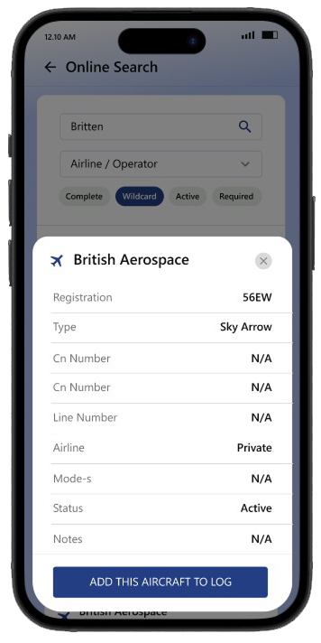
UI Redesign
Visual DirectionI introduced a modern aviation-inspired interface system.
Design Language
- Calm blue gradients inspired by aviation dashboards
- Soft card layouts
- Minimal visual noise
- Rounded mobile-first components
- Focused typography hierarchy
- Large actionable buttons
Design System Thinking
I introduced reusable UI foundations:
Components
- Cards
- Search fields
- Chips
- Status badges
- CTA buttons
- Modal sheets
- Form inputs
Benefits
- Faster scalability
- Visual consistency
- Easier future development
- Better cross-platform adaptability
Accessibility & Mobile UX Considerations
Through workflow analysis and operational reviews, several usability gaps were identified.
Optimized For
- Outdoor brightness
- One-handed usage
- Fast tapping
- Tablet & mobile responsiveness
Improvements
- Larger tap targets
- Better contrast ratios
- Improved spacing system
- Readable typography hierarchy
Outcome
The redesign transformed the app from a utility-focused legacy experience into a modern aviation companion platform.
Expected Product Impact
- Faster aircraft logging
- Better user confidence
- Improved onboarding clarity
- More modern product perception
- Reduced interaction friction
What I Learned
This project reinforced the importance of:
- Designing for real-world environments
- Prioritizing speed over decoration
- Creating mobile-first workflows
- Balancing data density with clarity
- Designing systems, not just screens
I also learned how domain-specific applications require deep understanding of user context rather than generic UI improvements.
Final Reflection
The ADU Mobile redesign was not simply a visual refresh.
It was about transforming a technical aviation workflow into an intuitive mobile experience that users could rely on while actively spotting and logging aircraft in real-world conditions.
The result is a cleaner, faster, and more scalable experience that bridges aviation utility with modern mobile UX principles.